More resume templates
Browse allAbout the Banner template
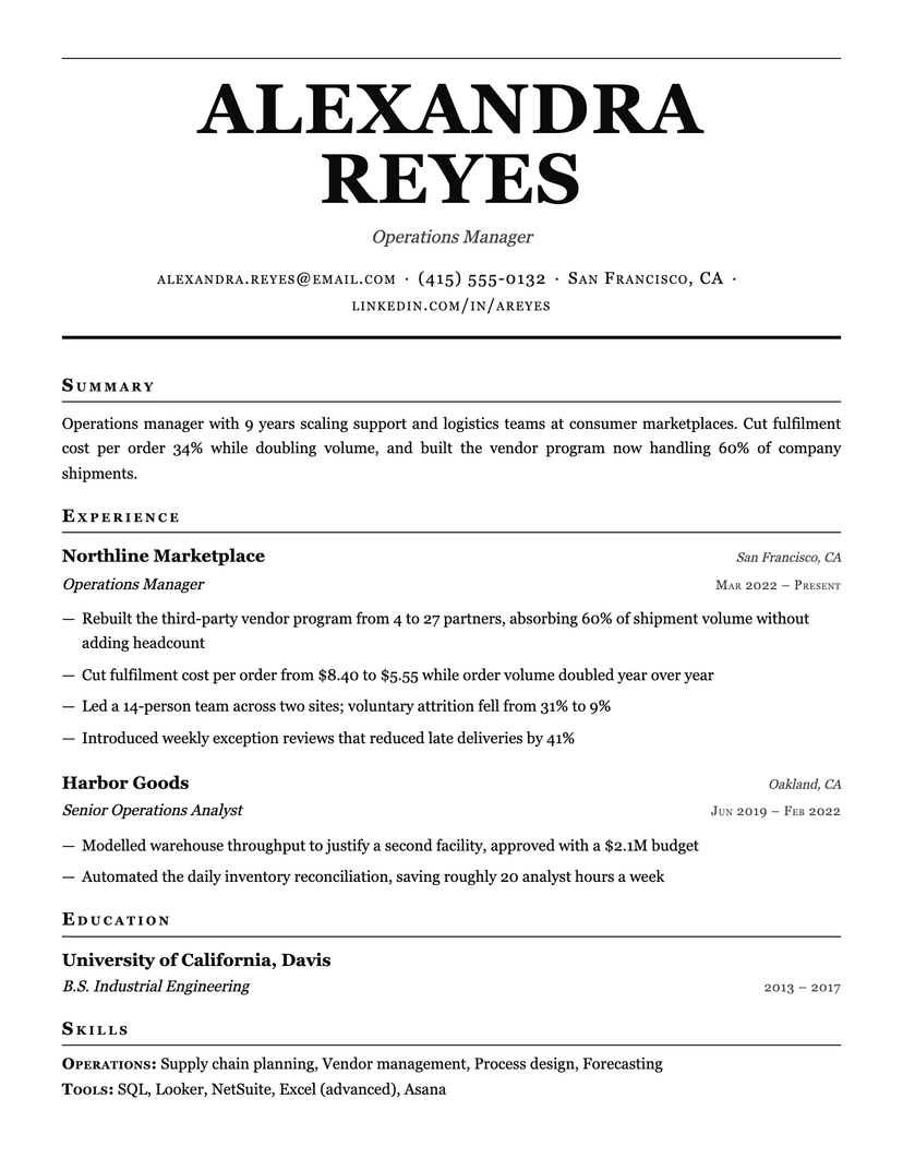
What the bands are actually doing
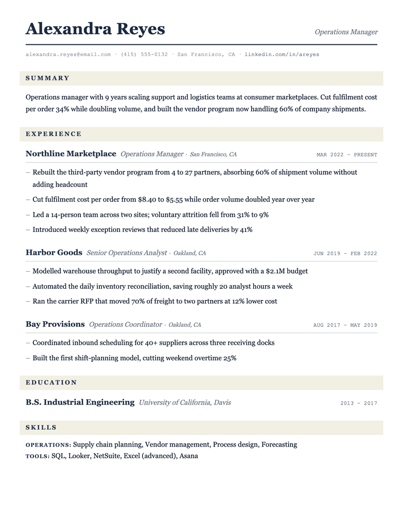
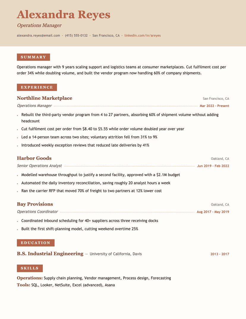
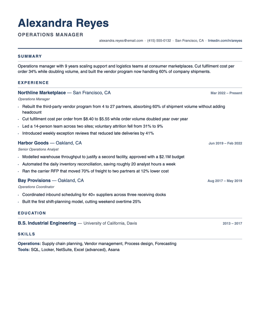
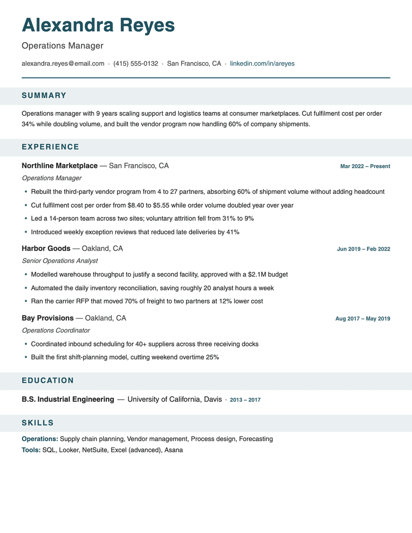
The strongest signal on a resume page is contrast, and most templates spend it on the name. Banner spends it on the section boundaries instead — the place a skimming reader is actually looking. Section titles are set in letterspaced caps on a 10% tint of the accent, so they register as landmarks at arm's length while staying quiet enough to read up close.
Everything else is deliberately restrained to pay for that: entries are one bold line (company and location), one italic line (title), and bullets. The accent appears in exactly three more places — the rule under your name, the dates, and the skill-group labels. Add more color and the bands stop being landmarks.
The tint is derived from whatever accent you pick rather than fixed, so switching to burgundy or forest re-colors every band, rule and date in one move and the page stays coherent.
Where Banner costs you
Bands eat vertical space — roughly a line and a half per section — so a resume that already fits one page by a hair will spill onto two. If you're fighting for space, Compact or Jake's gives that room back.
One caution that has nothing to do with us: colored bands print at the mercy of the printer. If you know the resume will be printed on a machine that struggles with solid fills, print a test page first — or pick a rule-based template like Left Rule, which needs no ink coverage at all.
Who the Banner template is for
Great fit
- Operations, program and project managers with long, section-heavy resumes
- Anyone whose resume runs to two pages and needs visible structure on both
- People who want obvious color without a sidebar or a two-column layout
Look elsewhere if
- One-page resumes already tight on space — the bands cost vertical room
- Conservative fields where any block of color reads as loud (use Burgundy or Classic)
Already have a resume? See exactly what an ATS parses out of it.
Run the free ATS checker