
More resume templates
Browse all
Timeline
timeline · visual

Editorial
modern · editorial
Ink Block
bold · monochrome
Underline Accent
modern · monochrome

Numbered
systematic · editorial
Blueprint
technical · structured
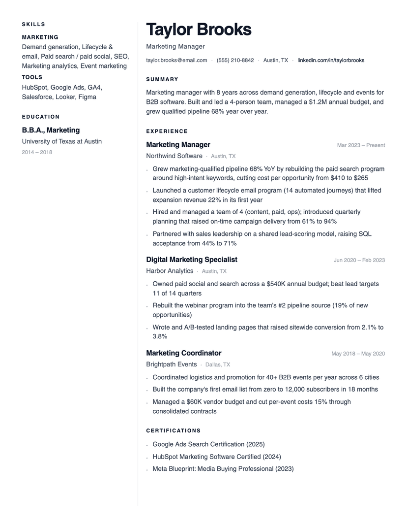
Lumen
minimal · two-column
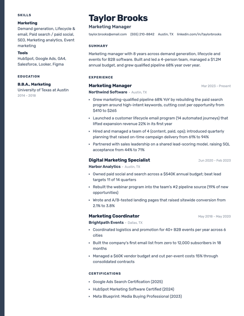
Slate Rail
two-column · modern
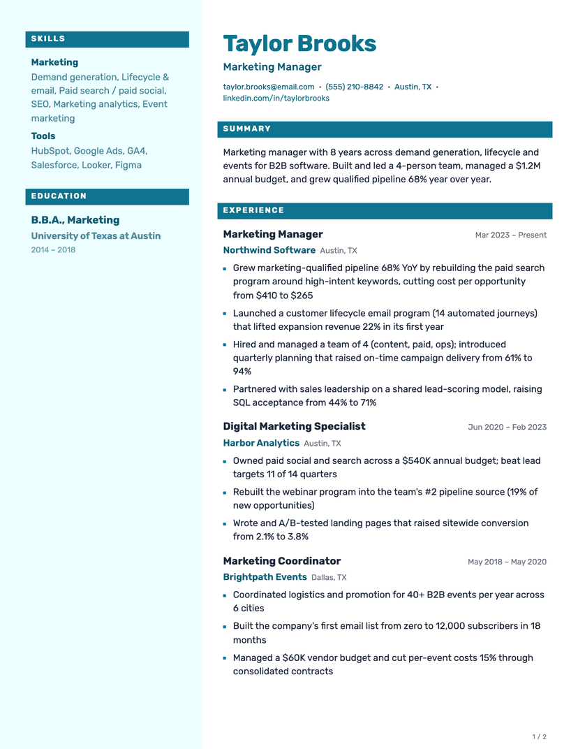
Fathom
two-column · modern

Aperture
two-column · modern
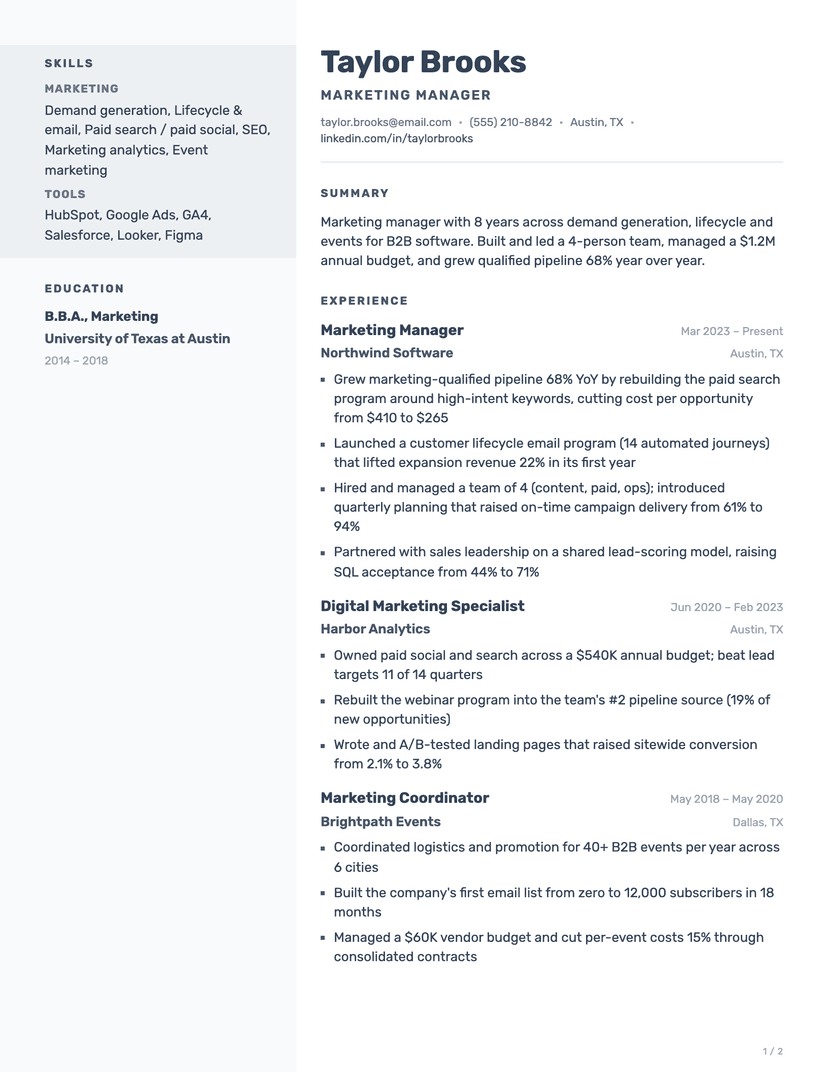
Cadence
two-column · modern
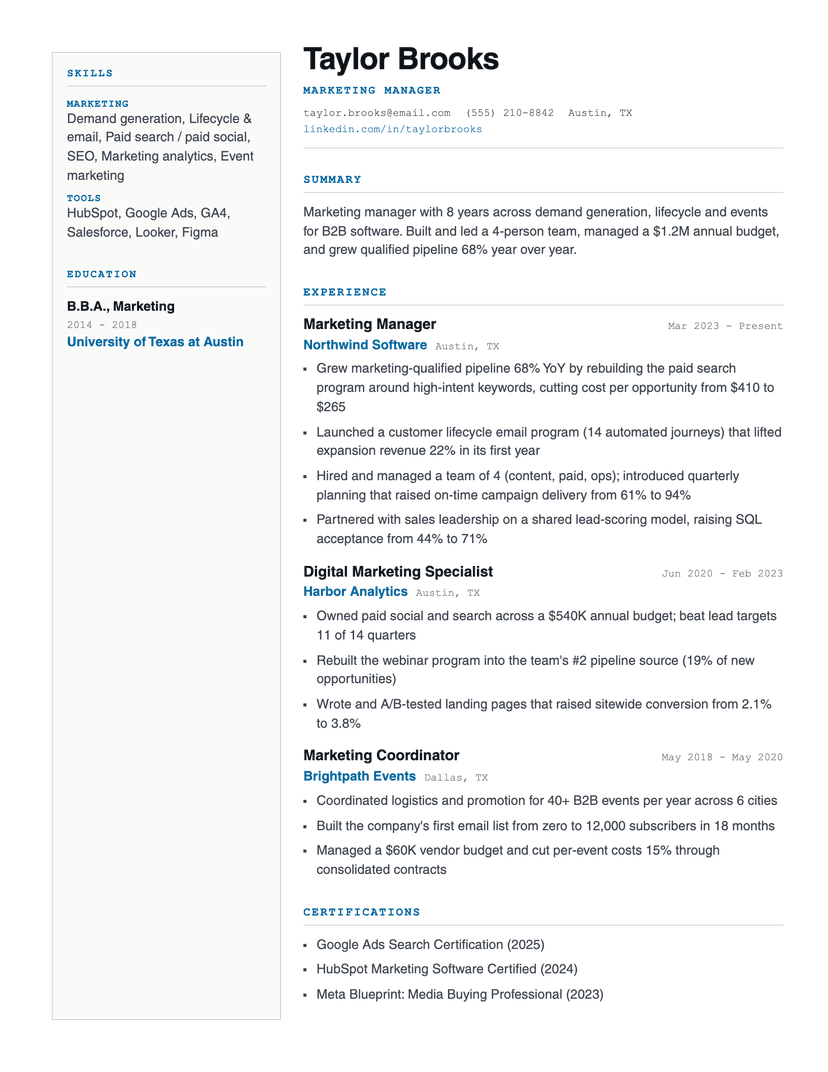
Foundry
two-column · technical
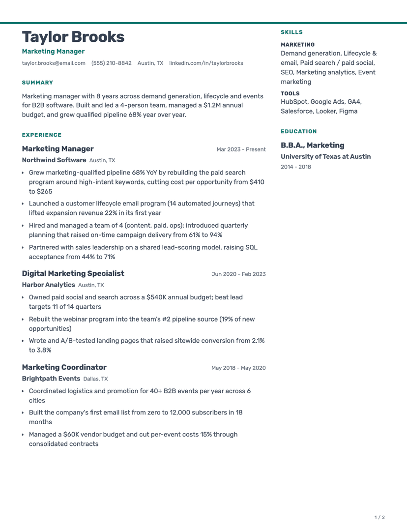
Halyard
two-column · modern

Jake's Resume
dense · serif
This template is also in
About the Bracket template
Two typefaces doing two jobs
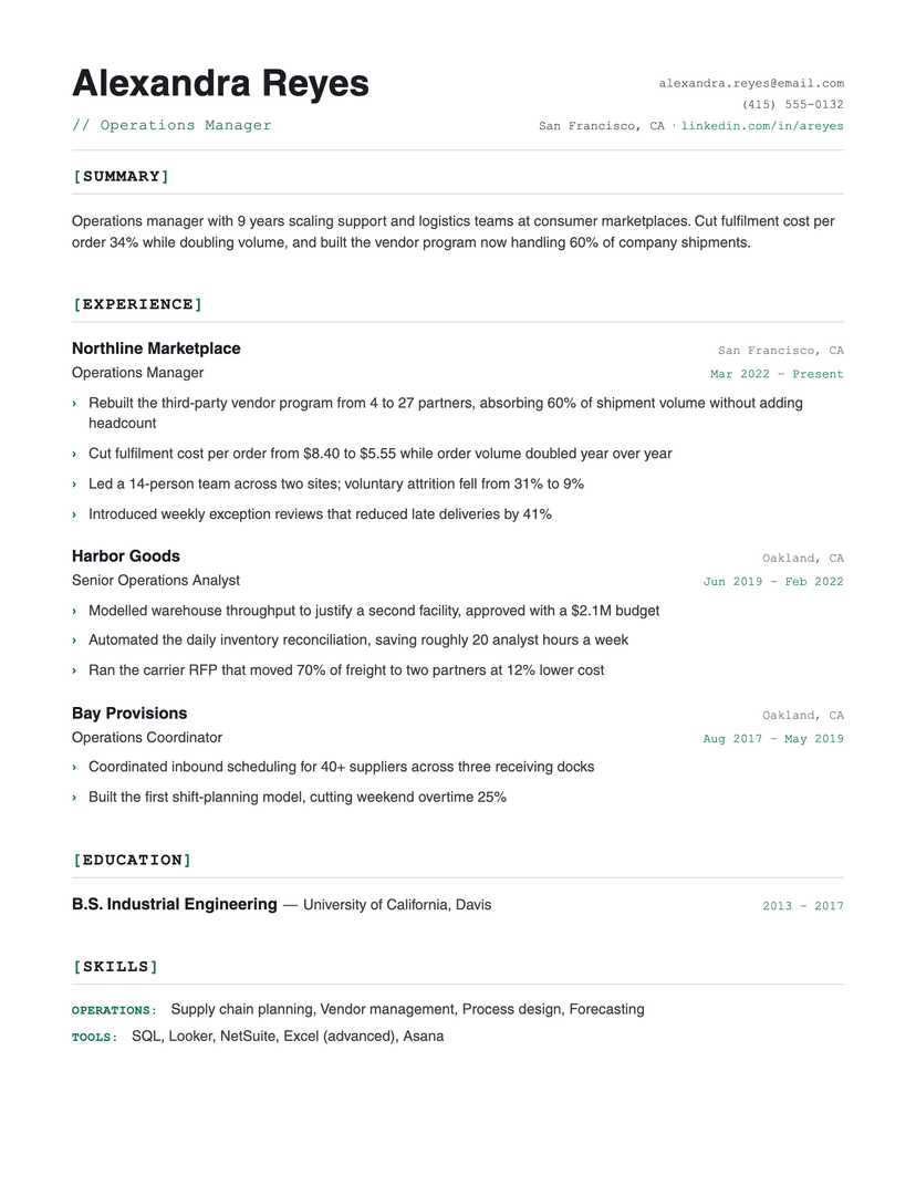
The whole design rests on one split: metadata is monospace, content is sans. Dates, locations, skill categories and the bracketed section titles all sit in the fixed-width face, so the eye learns in two seconds which text is a label and which is a claim. Because the monospace never touches your bullets, none of the readability cost of a fully typewritten resume is paid — bullets stay in Helvetica at a comfortable line height.
The brackets themselves are the accent's only strong appearance in the header area: the brackets are colored, the section word is not. That keeps the color budget to a hairline under the header, the dates, the bullet chevrons and the skill labels — enough to feel deliberate, never enough to look decorated.
Where Bracket is the wrong choice
The device is legible as a signal: it says software, data, infrastructure. In law, healthcare administration, education or finance it reads as costume rather than craft — Classic or Left Rule fit those rooms better. It is also the wrong pick if your resume is mostly long prose paragraphs: the monospace labels only pay off against short, structured entries with real dates and locations to mark.
Who the Bracket template is for
Great fit
- Software, data and infrastructure engineers who want a technical signal without a gimmick
- Anyone whose history is dense with dates, locations and tooling to label
- Candidates applying to engineering-led companies where a README aesthetic reads as fluent
Look elsewhere if
- Conservative industries — law, finance, healthcare administration (use Classic)
- Resumes carrying long descriptive paragraphs rather than structured, dated entries
Already have a resume? See exactly what an ATS parses out of it.
Or rewrite it in the CVJet Resume Editor, where your ATS score updates as you edit and any template above is one click away.