
More resume templates
Browse all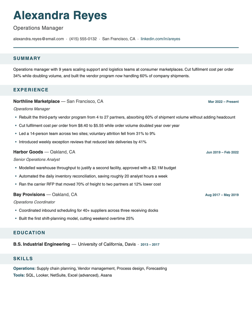
Banner
bold · structured
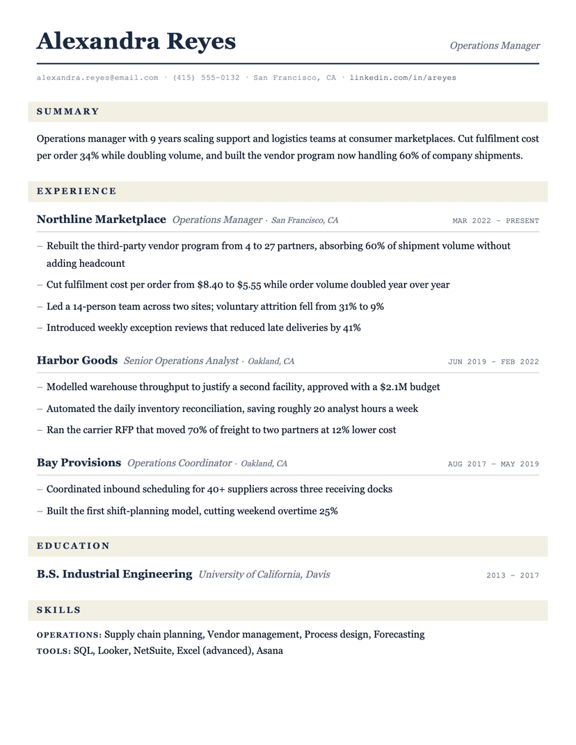
Ledger
serif · traditional
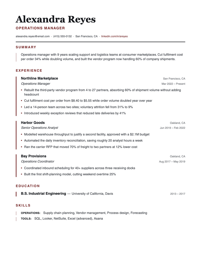
Left Rule
structured · serif-header
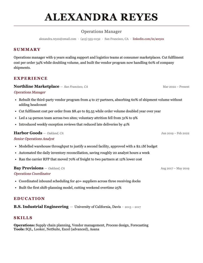
Burgundy
formal · serif
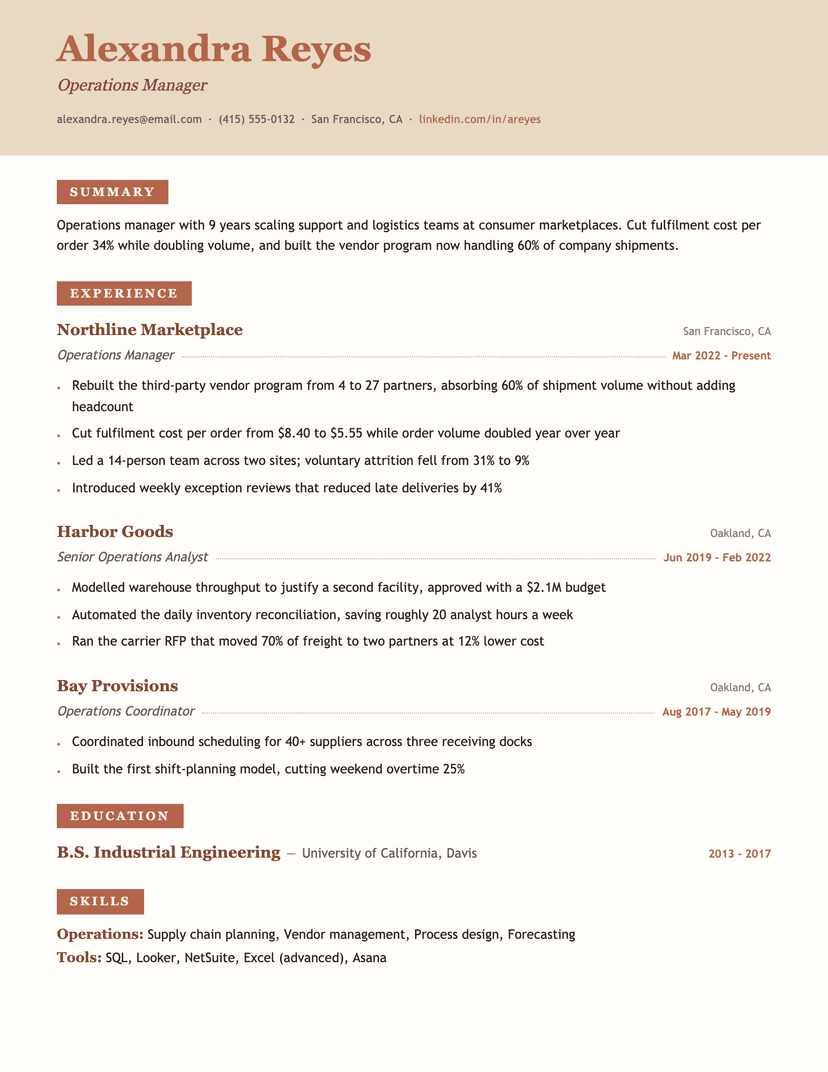
Terracotta
warm · serif
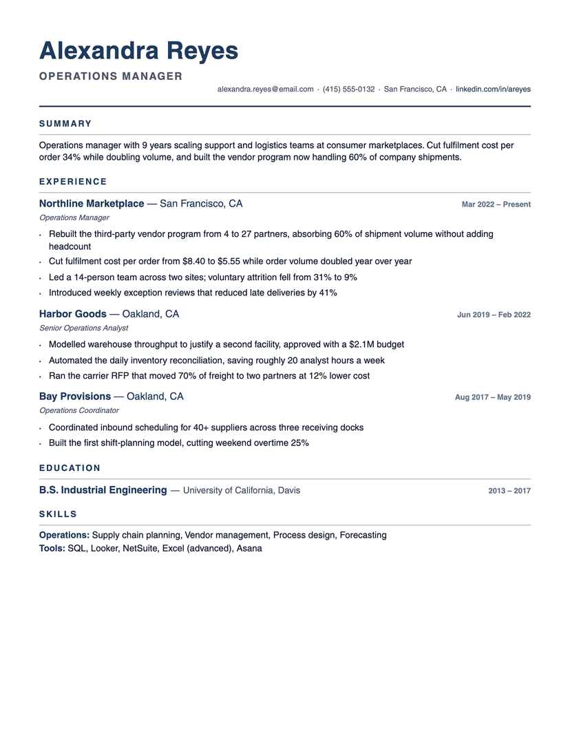
Compact Pro
compact · dense
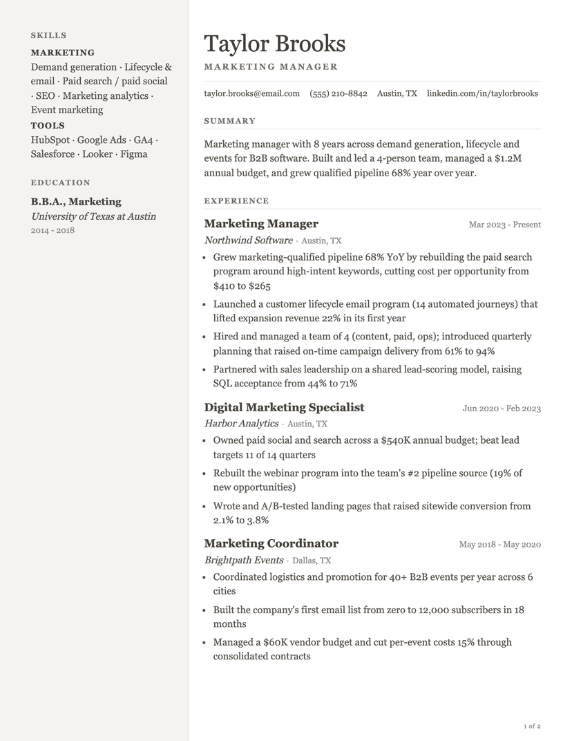
Pallas
serif · two-column
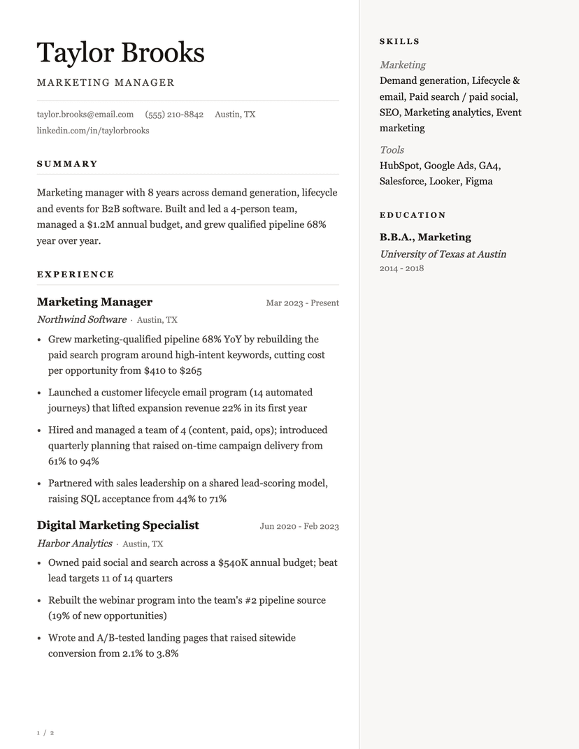
Ovation
serif · monochrome
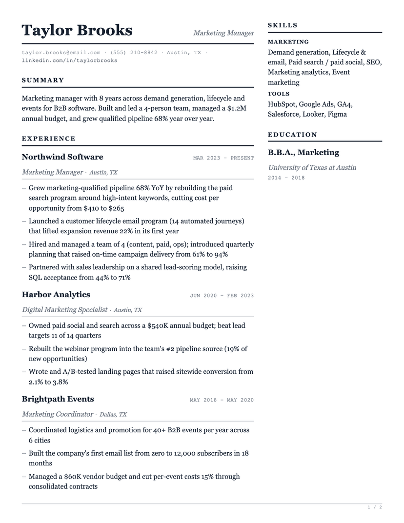
Ledger Two
two-column · serif
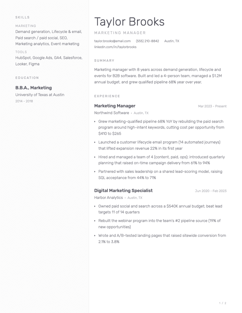
Porcelain
minimal · light
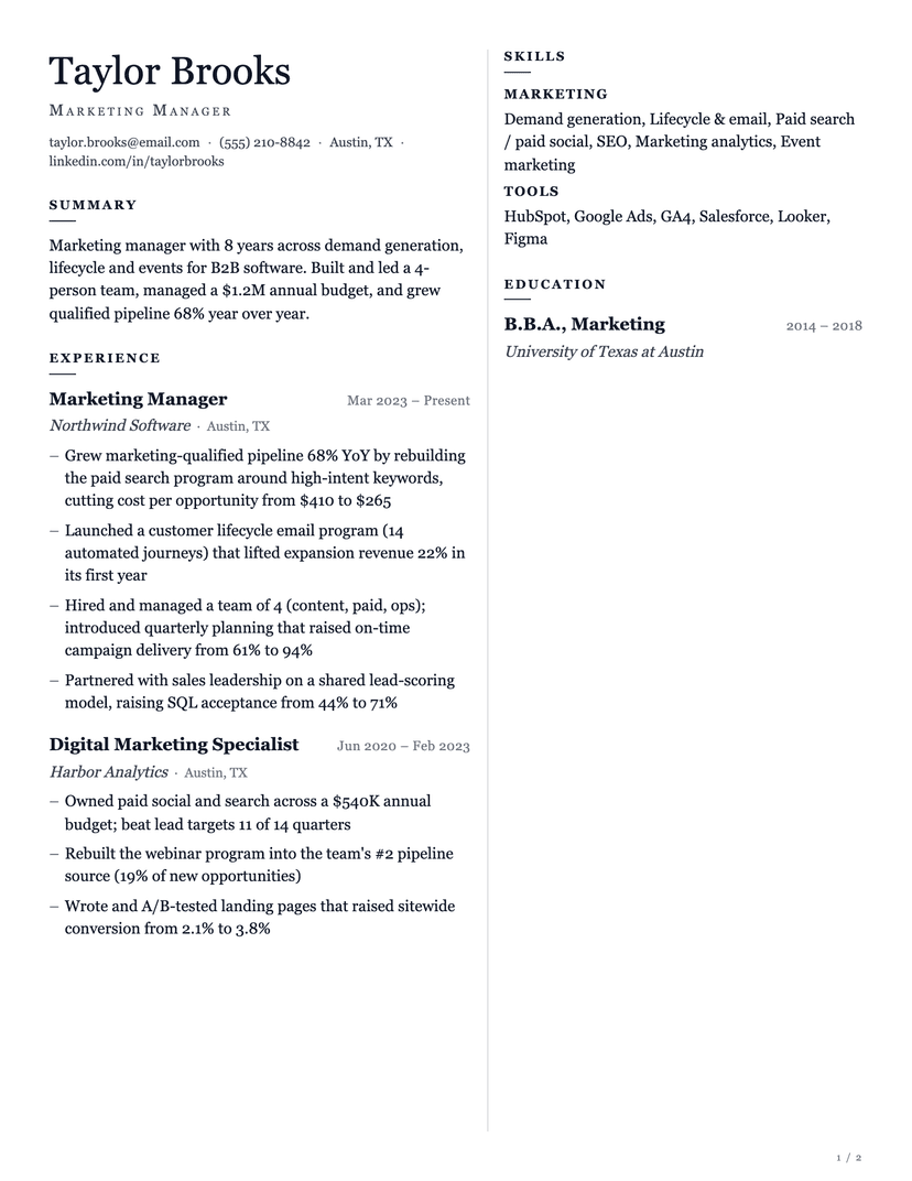
Corbel
two-column · serif
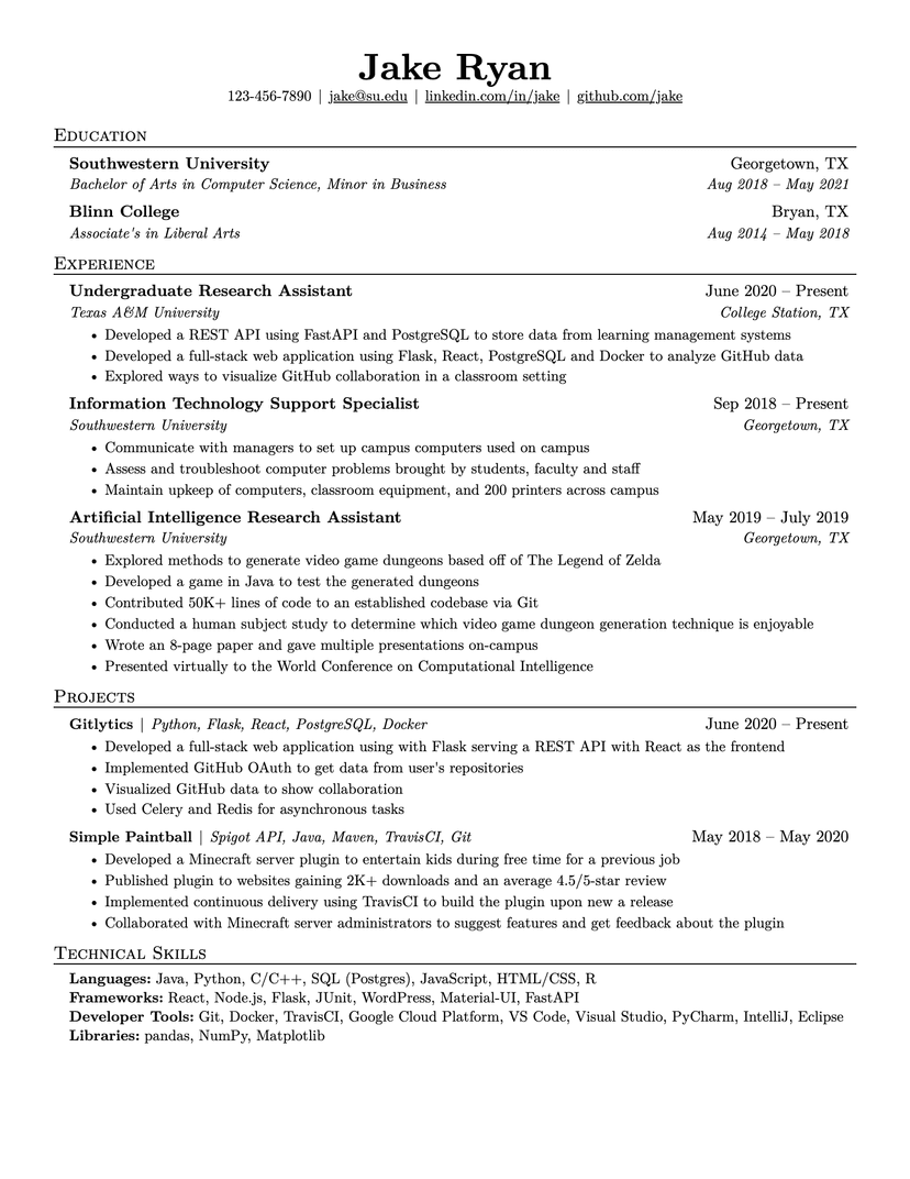
Jake's Resume
dense · serif
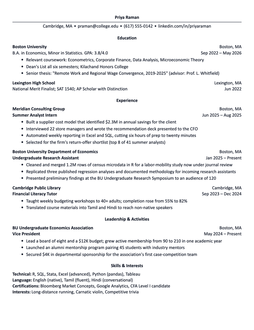
Harvard
academic · plain
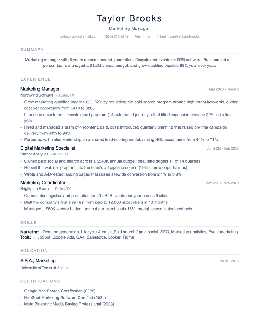
Minimalist
minimalist · whitespace
About the Broadsheet template
Why the masthead works
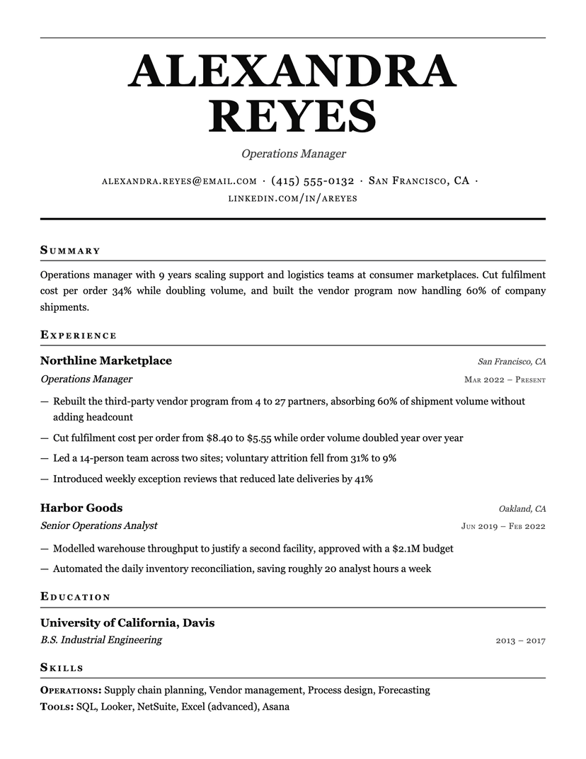
Most resume headers try to be interesting: a color band, a photo, a two-column contact grid. Broadsheet does the opposite and simply makes the name unmissable — 58px of centered serif caps, with the rules doing the framing rather than a fill. The result reads as authority rather than personality, which is exactly the trade a print newspaper makes.
The small-caps contact line is the second half of that trick. Small caps sit at x-height, so a long line of email, phone, city and profile URL reads as one calm band instead of four competing pieces of text.
Where Broadsheet is the wrong choice
The masthead is expensive: it eats roughly a fifth of page one before a single job appears. If you are trying to fit a dense internship-plus-projects history onto one page, Jake's or Compact will hold far more. Broadsheet also commits hard to a serif voice — if you are applying into product design, startups or anything where the resume itself is read as a work sample, the serif reads as conservative rather than classic. Choose Editorial or Minimal there.
Who the Broadsheet template is for
Great fit
- Senior and executive candidates whose name carries weight on its own
- Academic, legal, publishing and policy roles where a serif voice is the house style
- Anyone with a short, high-signal history that benefits from generous framing
Look elsewhere if
- Dense student resumes — the masthead costs a fifth of page one (use Jake's)
- Design, startup and creative roles where a serif page reads as conservative (use Editorial)
Already have a resume? See exactly what an ATS parses out of it.
Or rewrite it in the CVJet Resume Editor, where your ATS score updates as you edit and any template above is one click away.