More resume templates
Browse allAbout the Burgundy template
Why the accent stops after two uses
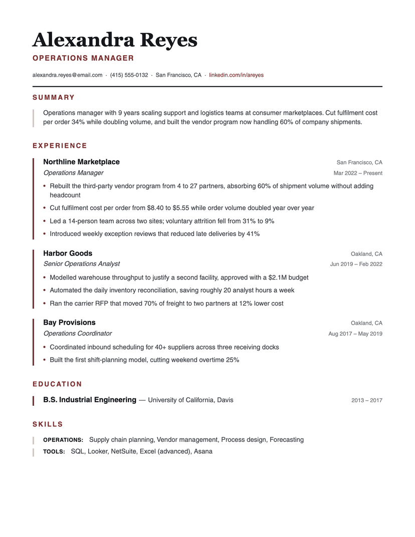
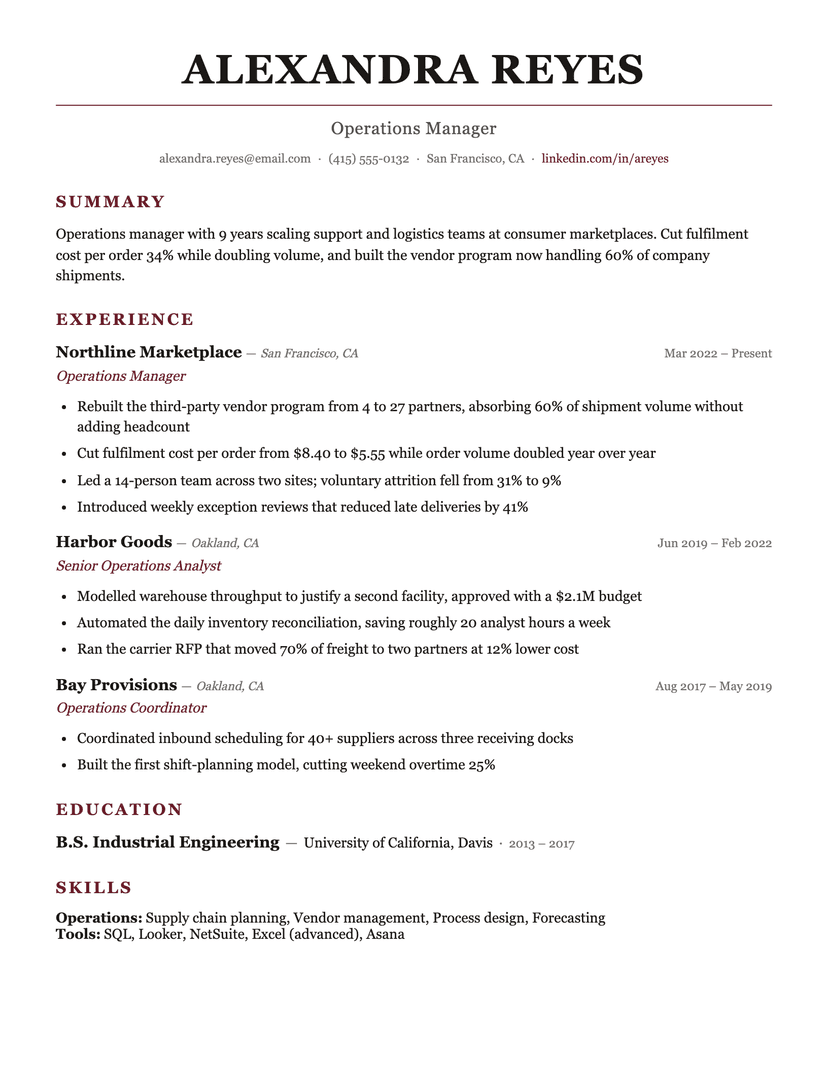
Color on a resume is a budget, and most templates overspend it: an accent on the name, the headings, the company, the dates and the links leaves nothing emphasized because everything is. Burgundy spends it twice — on section labels, so a reader can find their way, and on job titles, because that is the line a hiring manager actually wants. Companies, dates and locations stay in ink and gray.
The single 1.5px rule under the name works the same way. It is the only line on the page, so it reads as a masthead device rather than as ruling; add a second rule anywhere and it becomes a form. The restraint is what makes the oxblood register as considered instead of loud, and it survives a preset switch: pick navy or forest and the discipline still holds, because there is only one thing being colored.
Serif, centered, and who that suits
A centered serif masthead is a conservative signal. In law, finance, academia, medicine and the senior end of most professions it reads as appropriate; in startups and design it can read as stiff. That is a positioning choice, not a quality one — pick it if the room you're walking into rewards formality.
Georgia stands in for the design's Cambria in the browser render; the Word download uses real Cambria, which every copy of Word ships, so the .docx keeps the exact typeface rather than a substitute.
Who the Burgundy template is for
Great fit
- Law, finance, government, academia and medicine — fields where formality is the norm
- Senior candidates whose title history is the headline
- Anyone who wants color on the page without any of it looking like decoration
Look elsewhere if
- Startup, design and creative roles where a serif masthead reads as stiff
- Dense one-pagers — the generous leading and 30px section air cost space
Already have a resume? See exactly what an ATS parses out of it.
Run the free ATS checker