More resume templates
Browse allAbout the Compact Pro template
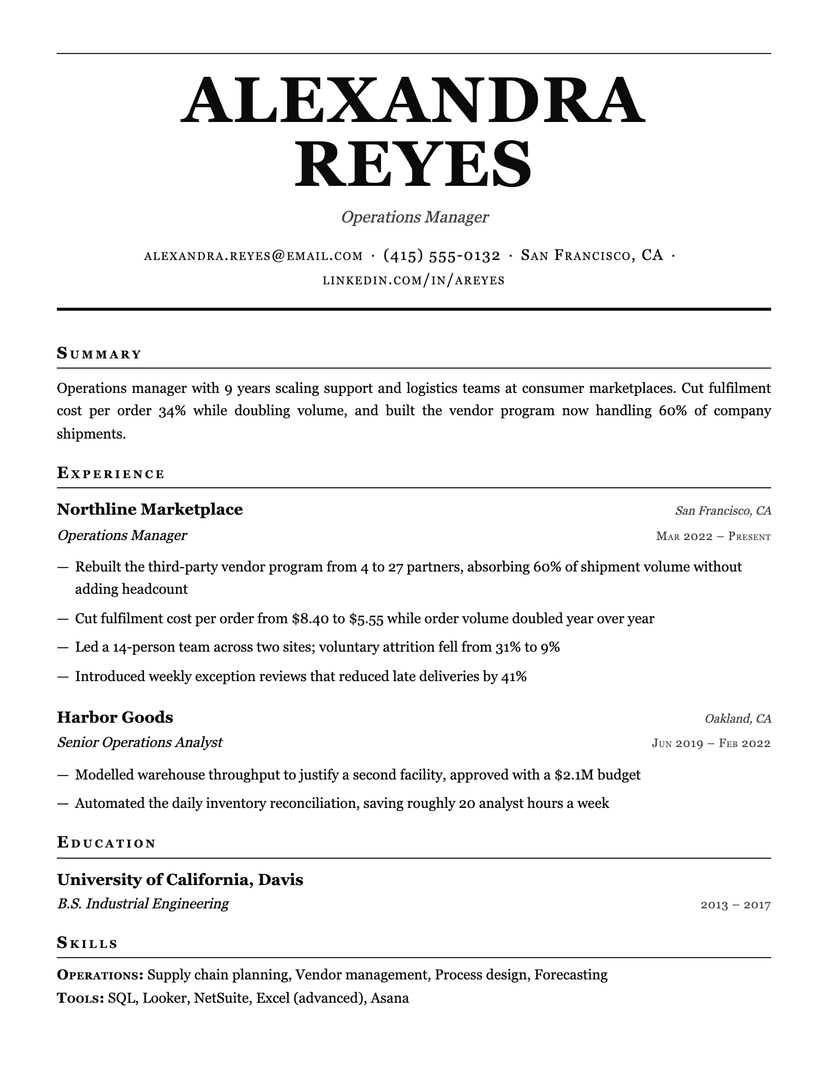
Density from rhythm, not from cramming
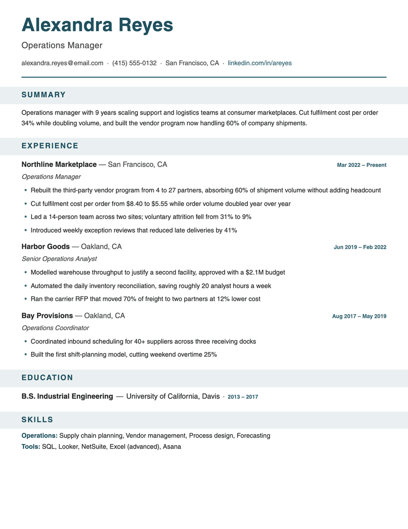
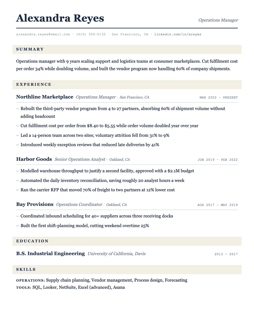
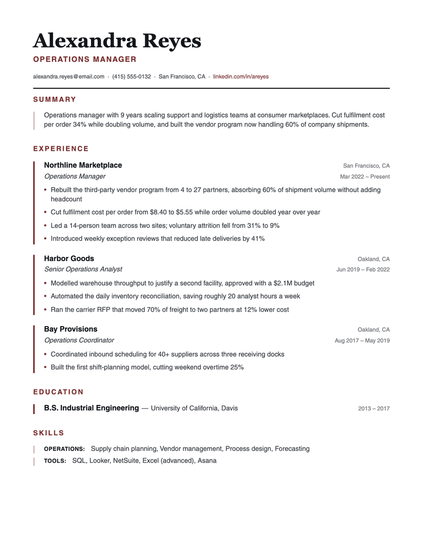
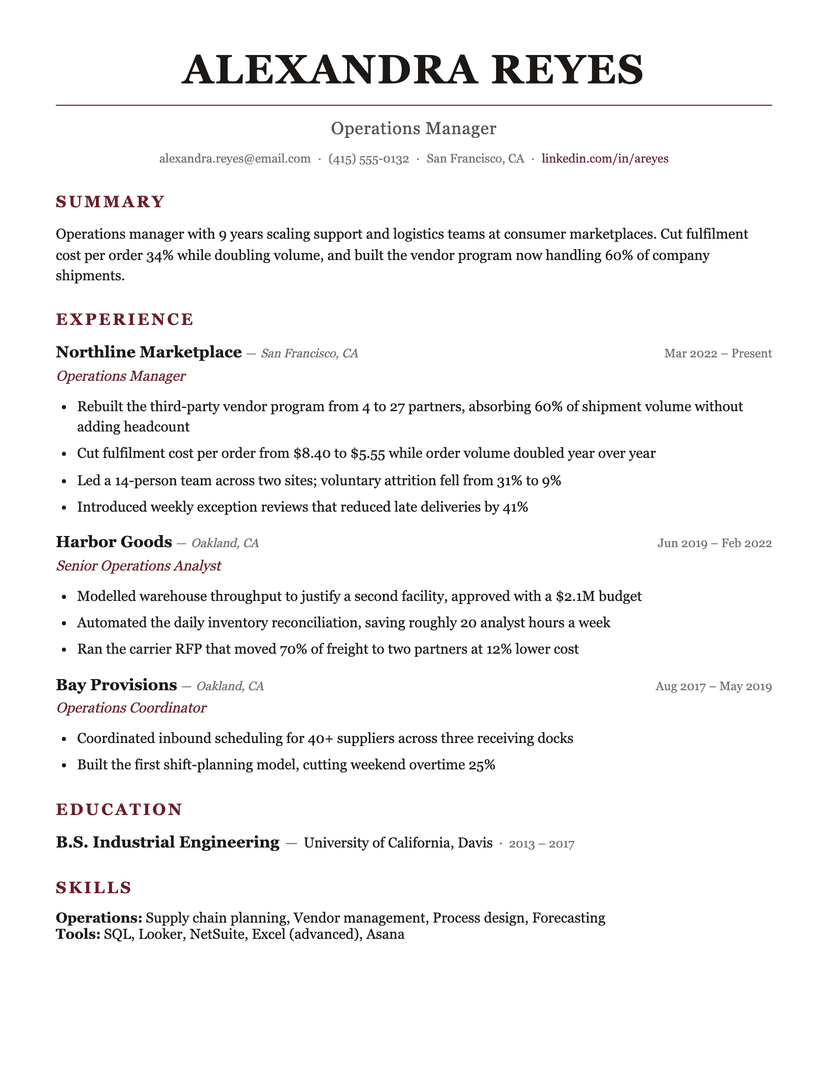
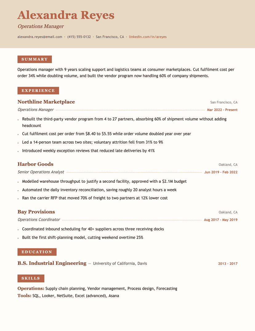
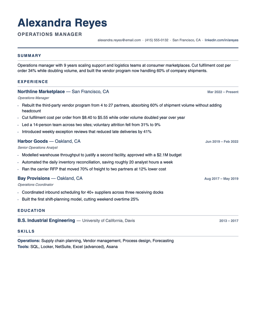
There are two ways to fit more on a page. One is to shrink the type and squeeze the margins until it technically fits — the result reads as a wall and recruiters skim past it. The other is to make every entry repeat the same figure so the eye stops re-learning the layout: organization line, italic role line, square bullets, and a date on the same right-hand axis every time. Compact Pro takes the second route, which is why it stays readable at sizes where a looser design would not.
The specific savings are structural rather than typographic. The location rides next to the organization instead of claiming its own line, the role and the dates share baselines with things already on the page, and the contact details sit on the same line as the professional title — three lines recovered before the resume has said anything. The body text itself is a normal size; nothing here depends on the reader squinting.
Where Compact Pro is the wrong choice
A short resume looks underfed in it. With one role and a degree, the tight rhythm has nothing to organize and the page reads as sparse rather than efficient — a roomier template does that content more justice. And if you like white space as a stylistic statement, this is the opposite of that argument: it spends every millimetre it can on content, deliberately.
Who the Compact Pro template is for
Great fit
- Ten-plus-year careers with three or more roles that still have to fit one page
- Operations, finance and management resumes where the detail is the substance
- Anyone who has been told to cut a two-page resume down without dropping bullets
Look elsewhere if
- Early-career resumes with one role — the density has nothing to organize
- Anyone who wants an airy, white-space-forward page
Already have a resume? See exactly what an ATS parses out of it.
Run the free ATS checker