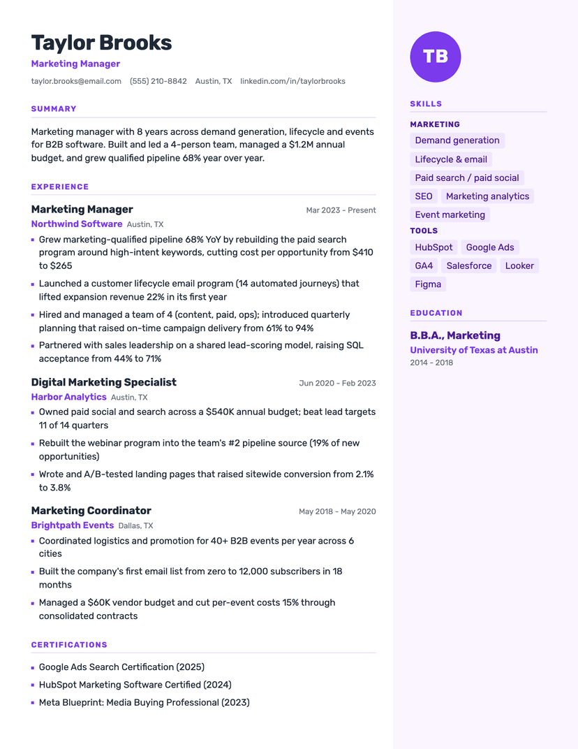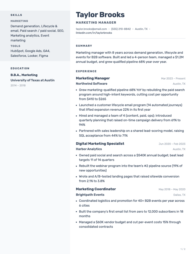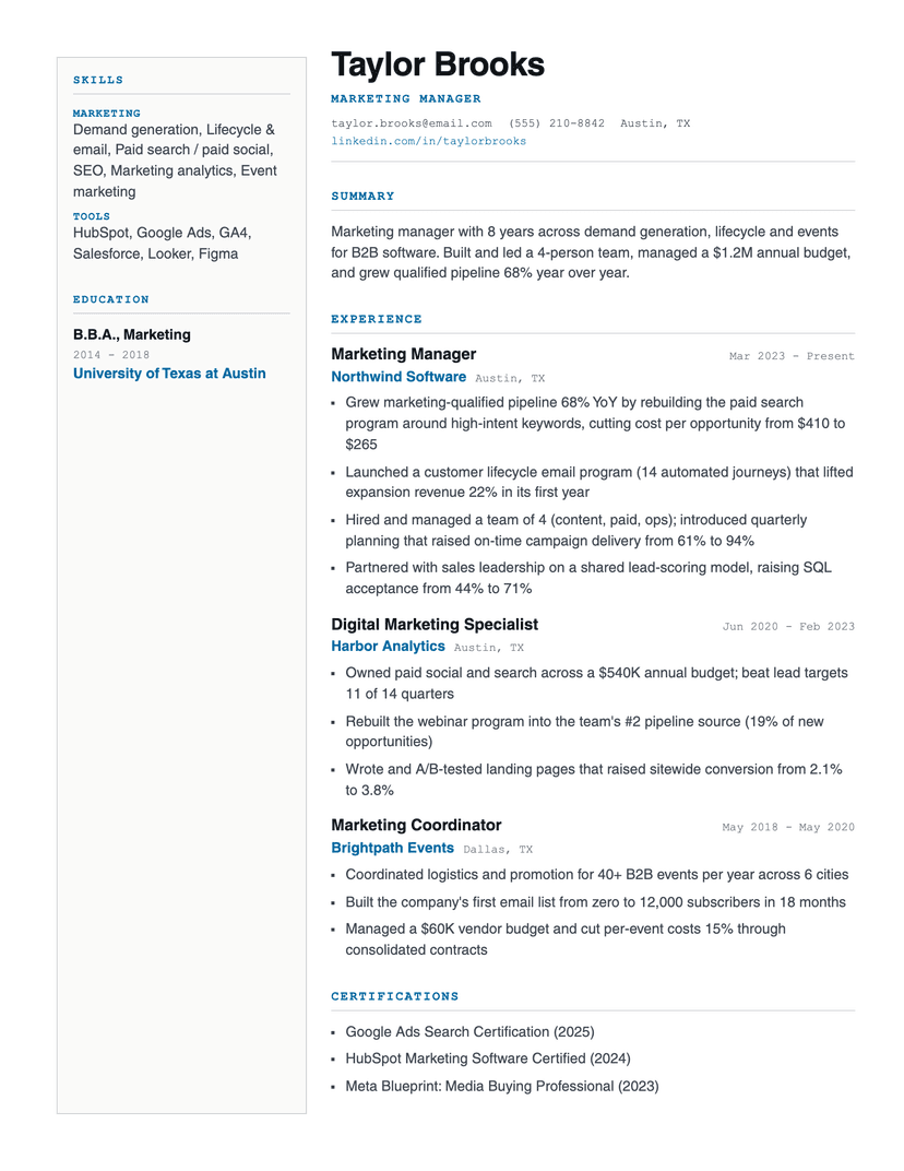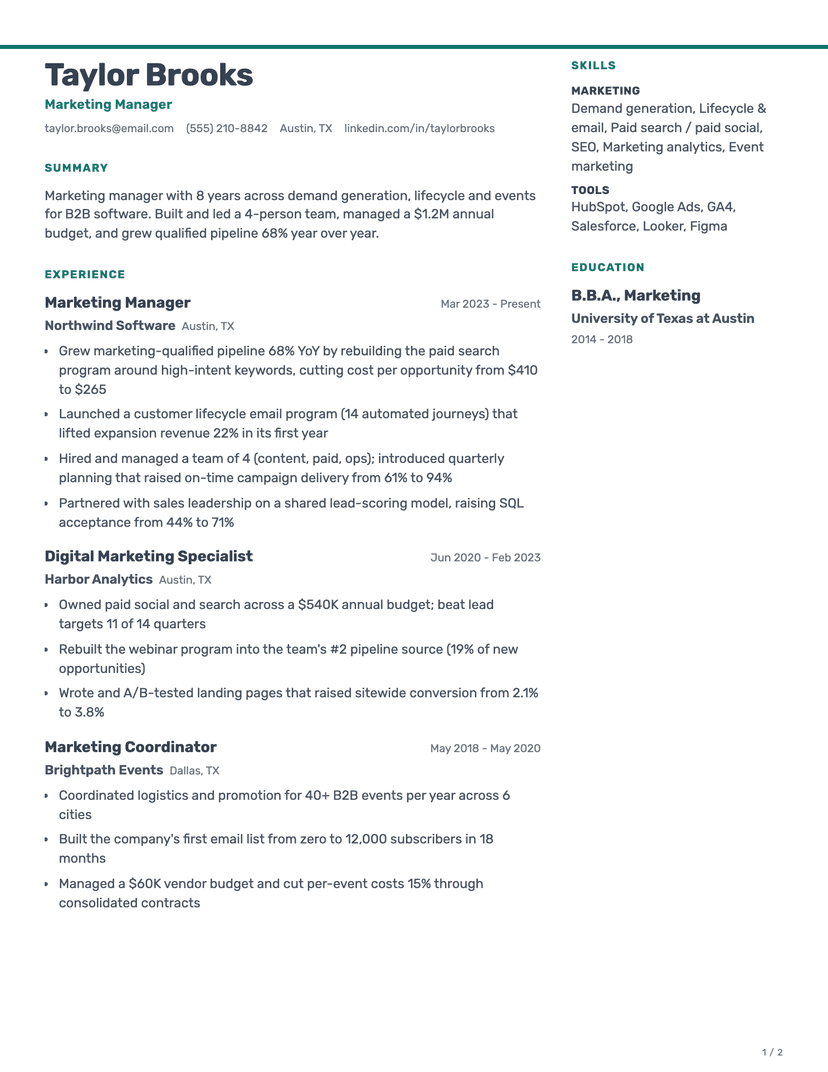
More resume templates
Browse allAbout the Editorial template
Title above employer, on purpose
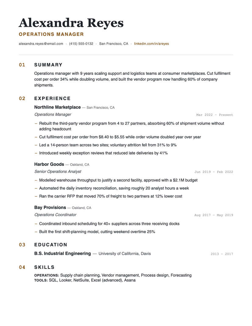
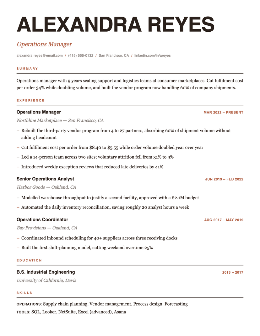
Most templates lead every entry with the company. That is the right call when the logos are the story. Editorial inverts it: the role is 15px heavy sans, the employer is 13px italic serif underneath. If you are changing industries, or your last three employers are names nobody outside the sector recognises, this ordering does real work — the scan lands on "Operations Manager" rather than on a company the reader has to decode first.
One accent colour carries all the coloured work — the eyebrow labels, the date stamps, the bullet dashes, the slashes in the contact line. Change it in the design panel and the whole page re-colours coherently; there is no second brand colour hidden anywhere.
Where Editorial is the wrong choice
The 64px headline and the 30px gaps above each eyebrow buy their drama with space — expect roughly one entry less per page than a dense template. It is also a deliberately styled page: in conservative finance, law or government screening, the coloured eyebrows read as a design choice you did not need to make. Classic or Broadsheet are the safer rooms.
Who the Editorial template is for
Great fit
- Career changers and specialists whose titles matter more than their employers' names
- Marketing, content, brand, product and design roles where the page is read as taste
- Anyone with 4–8 strong entries — enough to fill the spread without crowding it
Look elsewhere if
- Very dense histories — the headline and eyebrow gaps cost about an entry per page (use Compact)
- Conservative screening in law, finance or government, where colored labels read as decoration (use Classic)
Already have a resume? See exactly what an ATS parses out of it.
Run the free ATS checker