More resume templates
Browse all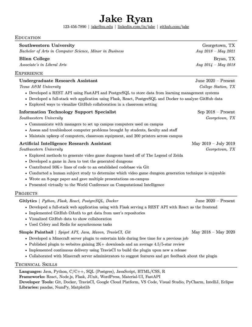
Jake's Resume
dense · serif
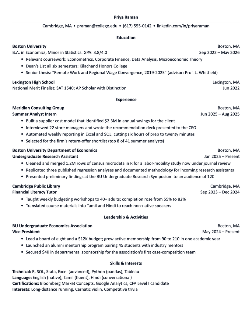
Harvard
academic · plain
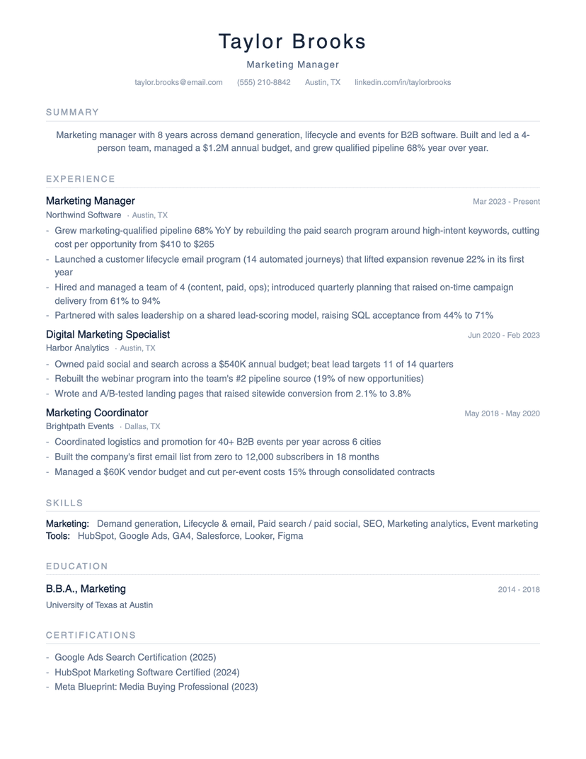
Minimalist
minimalist · whitespace
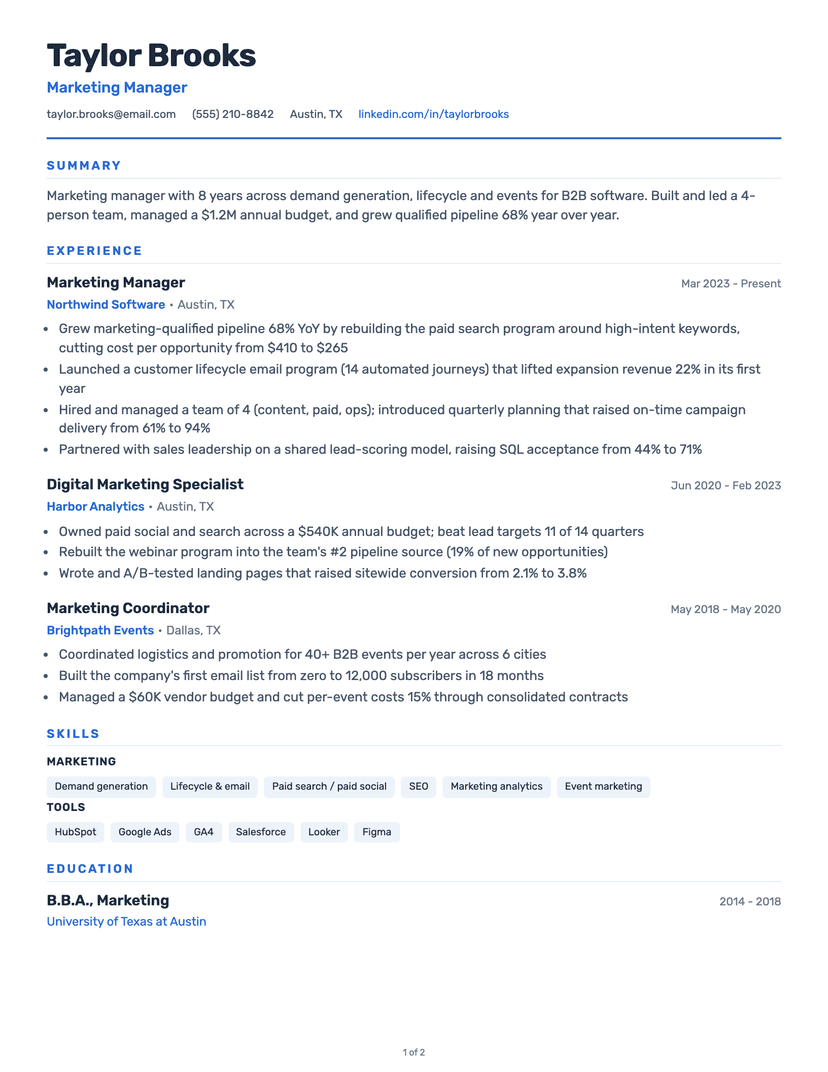
Classic
clean · traditional
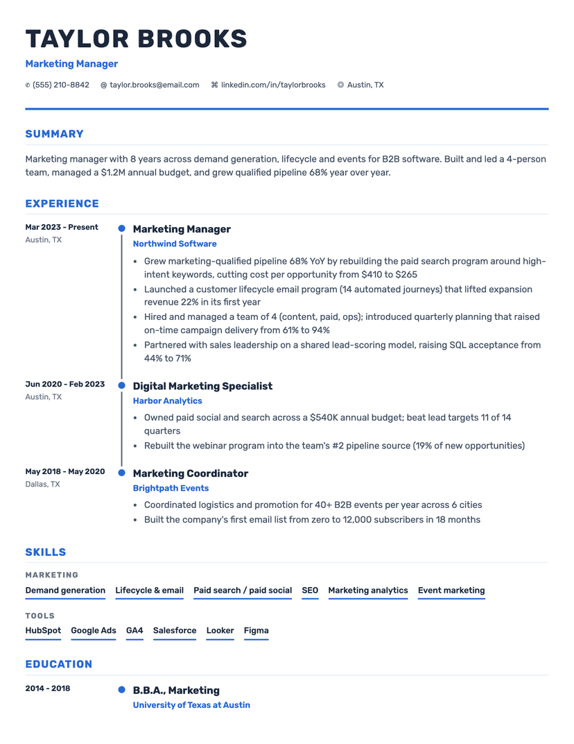
Timeline
timeline · visual
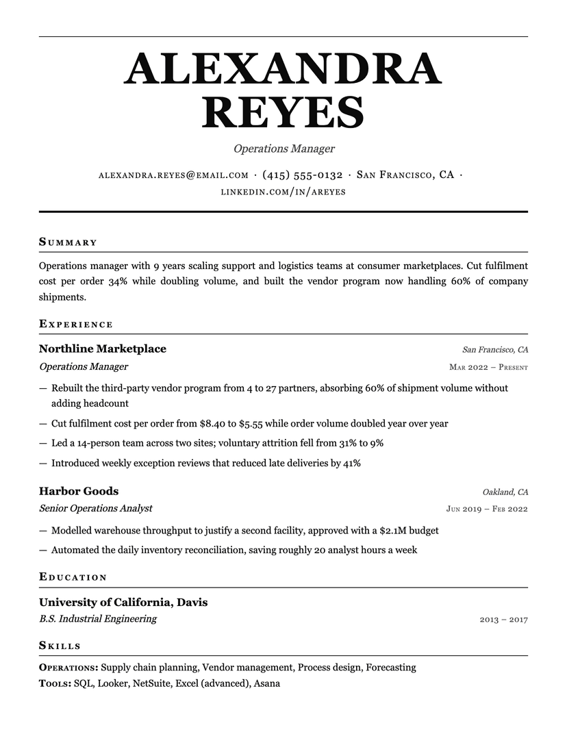
Broadsheet
serif · traditional
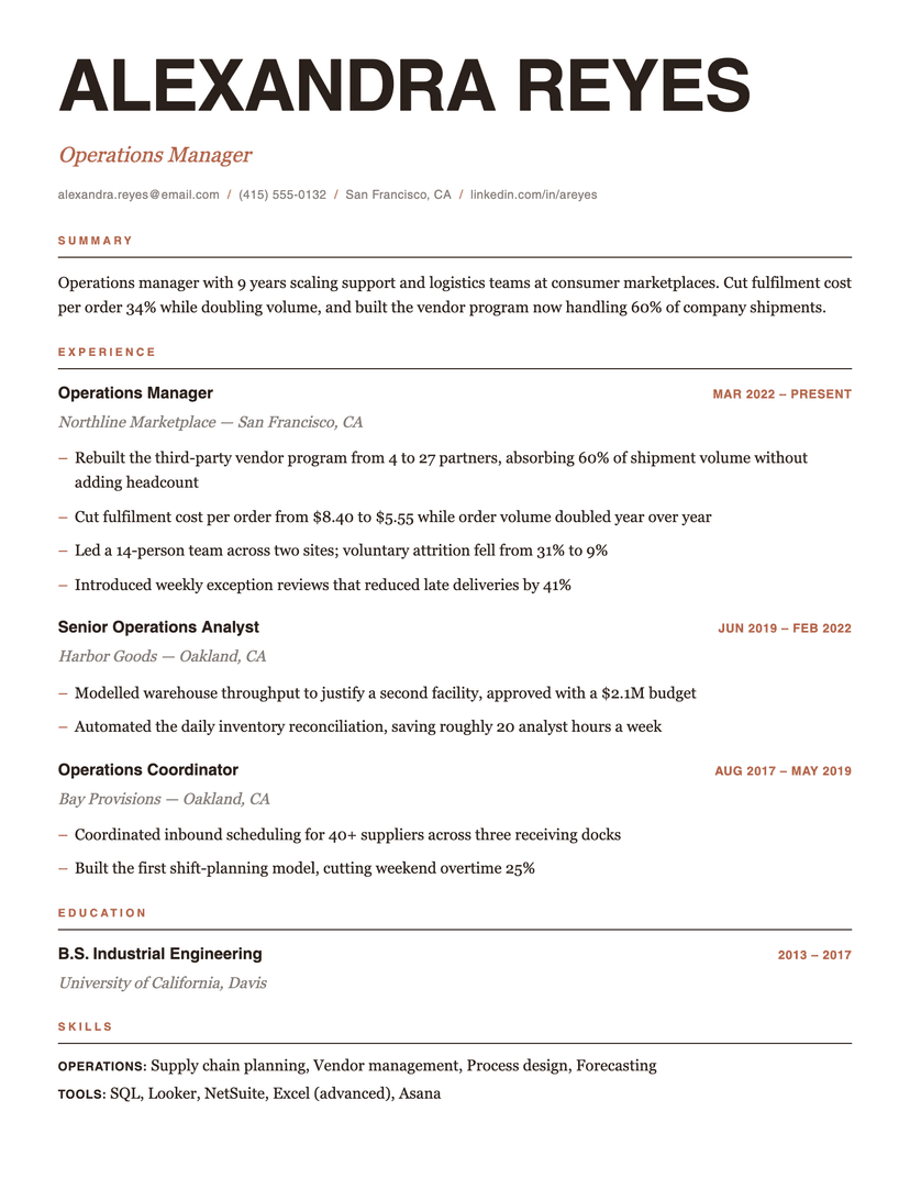
Editorial
modern · editorial
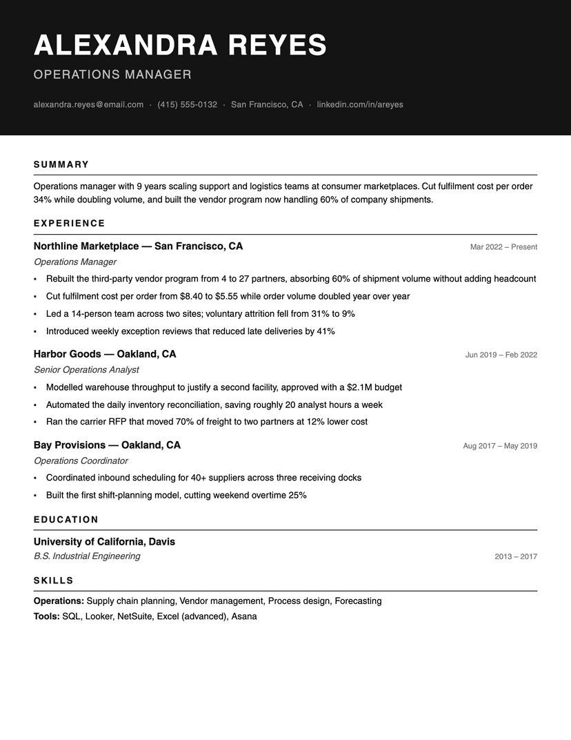
Ink Block
bold · monochrome
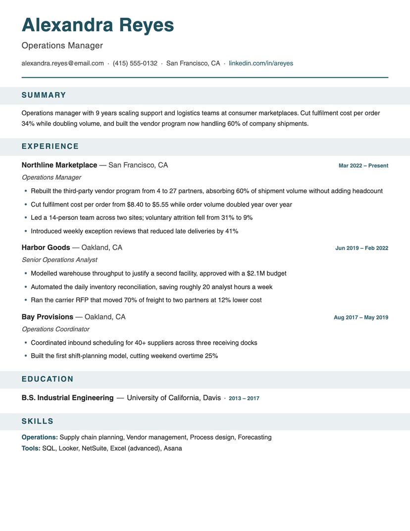
Banner
bold · structured
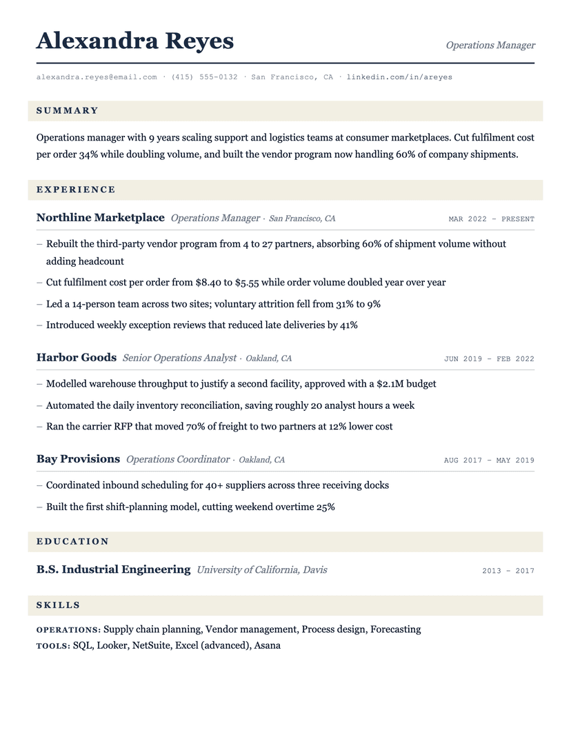
Ledger
serif · traditional
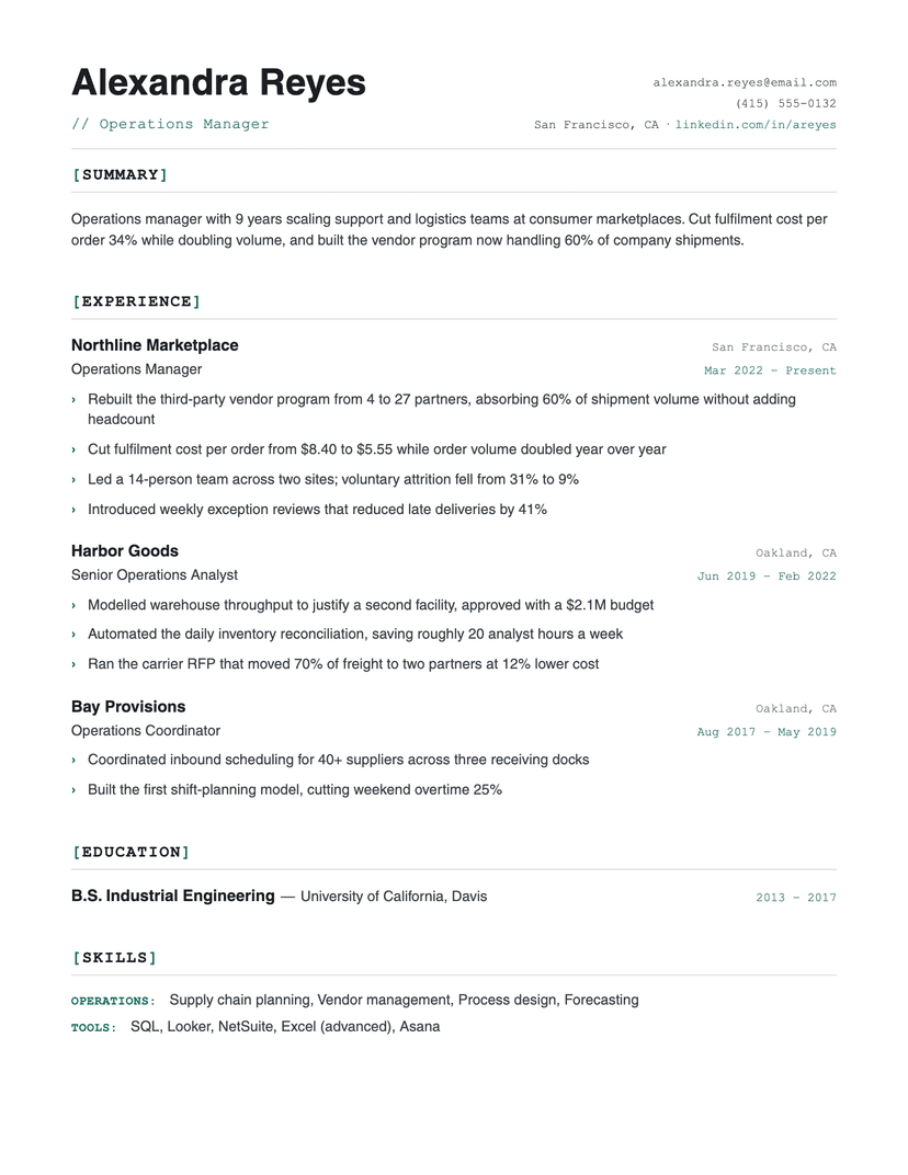
Bracket
technical · monospace
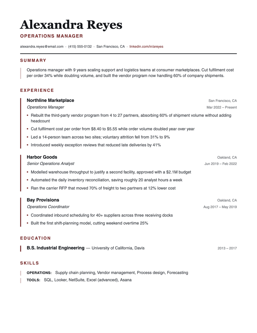
Left Rule
structured · serif-header
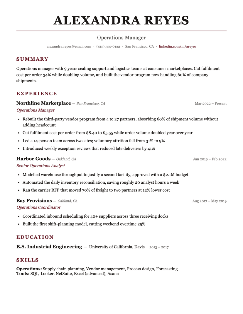
Burgundy
formal · serif
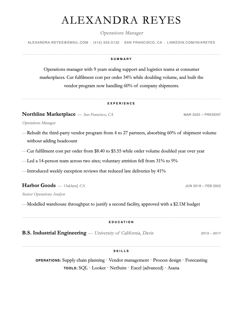
Dotted
minimal · centered
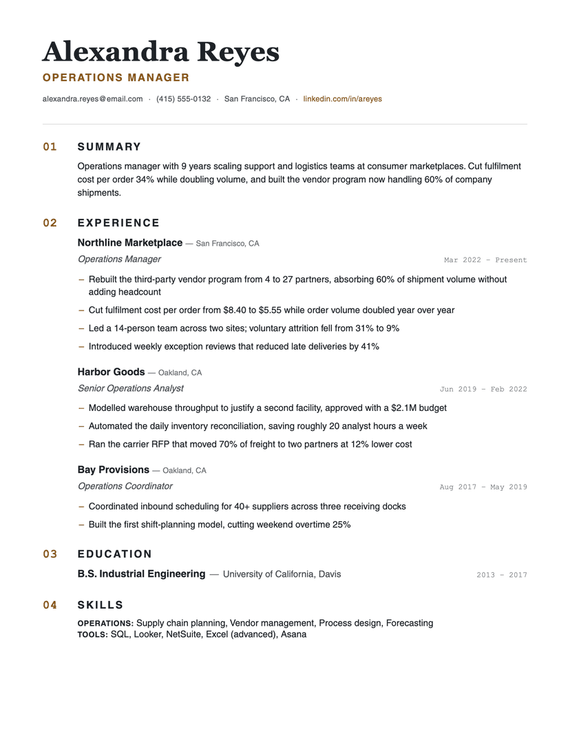
Numbered
systematic · editorial
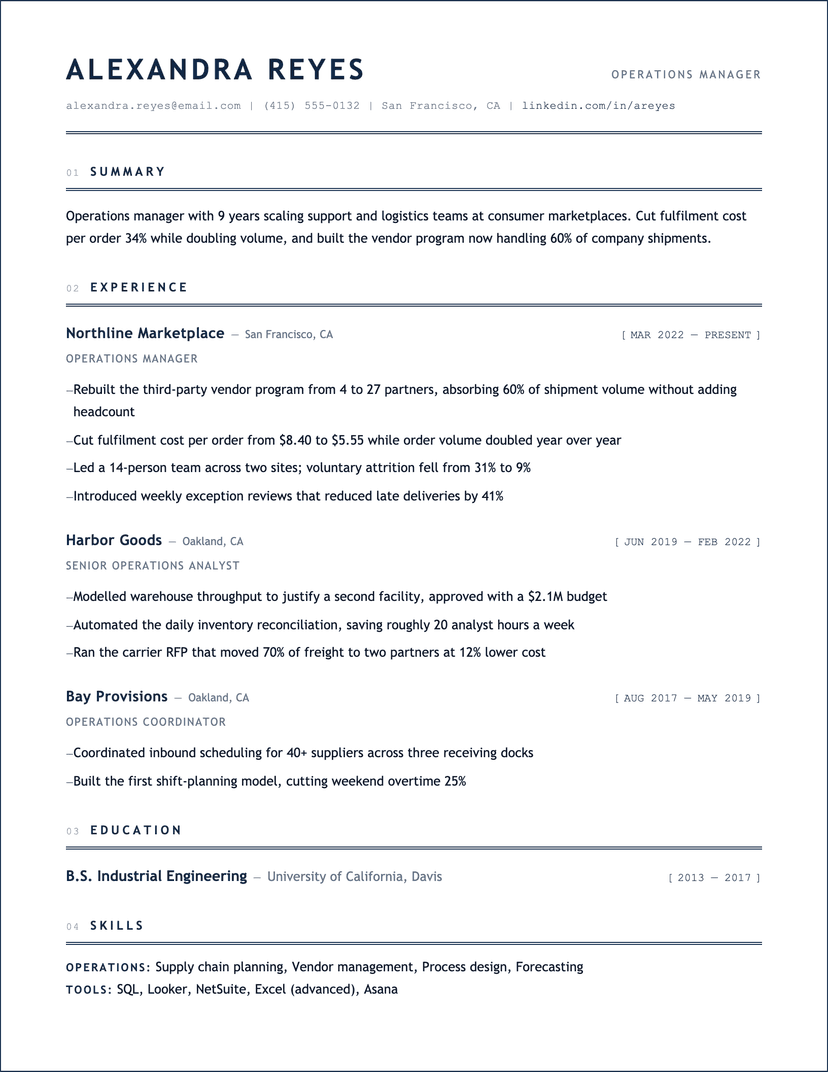
Blueprint
technical · structured
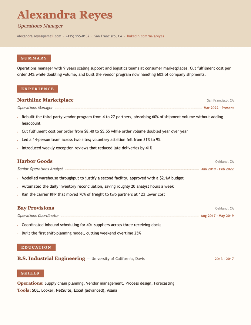
Terracotta
warm · serif
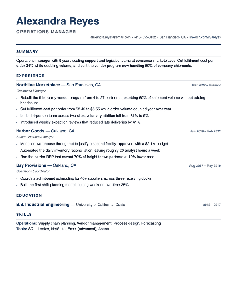
Compact Pro
compact · dense
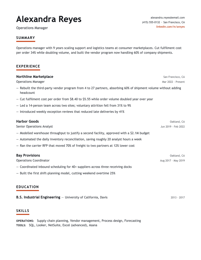
About the Underline Accent template
Why the underline stops at the word
A full-width rule under a heading reads as a divider — it separates the heading from what follows and cuts the page into bands. A rule that ends where the word ends reads as emphasis: it belongs to the title, and the section stays visually attached to its own heading. That single decision is what keeps five color marks on the page from looking like five horizontal cuts.
The rule is 4px — deliberately heavier than a hairline, so it registers as a mark rather than an underline typo — and it is the only saturated element in the document. Bullets use em dashes in the text color, dates and locations are gray, and the name is charcoal, not accent. A user switching the accent to navy, forest or bronze changes exactly five short marks and nothing else, which is why this template survives a color change better than most.
Where Underline Accent is the wrong choice
Because the color appears only at section titles, a resume with two sections gets almost no benefit — the device needs four or five headings to establish a rhythm. And in Word the underline becomes a thin full-width rule under each heading: the layout, content and hierarchy survive, but the point of the design does not. Send the PDF when the look matters.
Who the Underline Accent template is for
Great fit
- Marketing, product and design-adjacent roles that want restraint with one deliberate mark
- Anyone who plans to re-color the resume per company — the accent lives in one device
- Resumes with four or more sections, where the underline rhythm has room to work
Look elsewhere if
- Two- or three-section resumes, where the device has too few appearances to read
- Anyone who needs the Word file to look identical to the PDF
Already have a resume? See exactly what an ATS parses out of it.
Run the free ATS checker