More resume templates
Browse allAbout the Dotted template
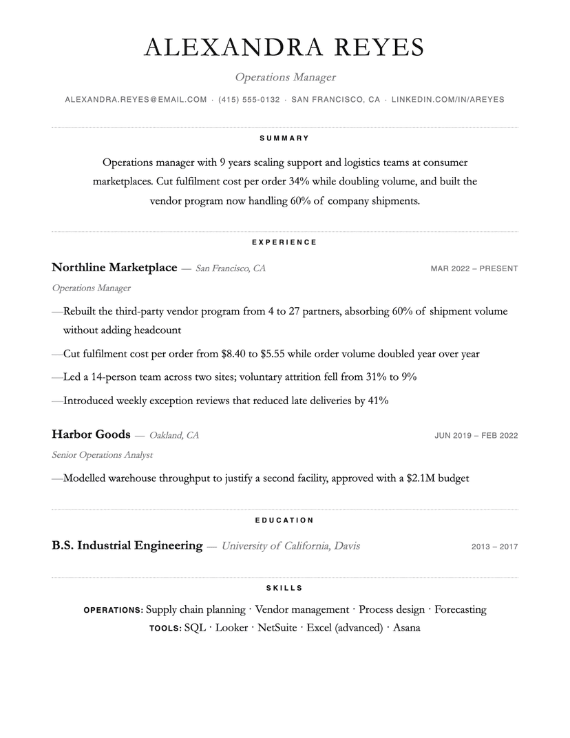
One separator, used consistently
Most templates end up with three or four rule weights — one under the name, another under section titles, a third around a sidebar — and the page starts to look assembled rather than designed. Dotted picks one and holds to it, which is why the page stays quiet even when it is full.
The narrow measure is doing the same job. Text lines cap around 560px, so the summary and the section labels sit in a column your eye can take in without tracking across the full page width. That costs density, deliberately.
Where Dotted breaks down
Centered section labels and a narrow measure both cost horizontal room, so a heavy resume — six sections, five bullets each — will run to a second page here where a denser template would not. And on a bad fax-quality print or an aggressive scan, dotted rules can drop out entirely; the page still reads, but the section rhythm goes with them.
Who the Dotted template is for
Great fit
- Editors, writers, researchers and academics who want a page that reads like a printed document
- Anyone with fewer, deeper roles rather than a long list of short ones
- Applicants who want restraint without going fully typographic-minimal
Look elsewhere if
- Dense technical resumes with long project and skill lists (use Jake's or Compact)
- Anyone who needs a strong color accent — this design is monochrome by construction
Already have a resume? See exactly what an ATS parses out of it.
Run the free ATS checker